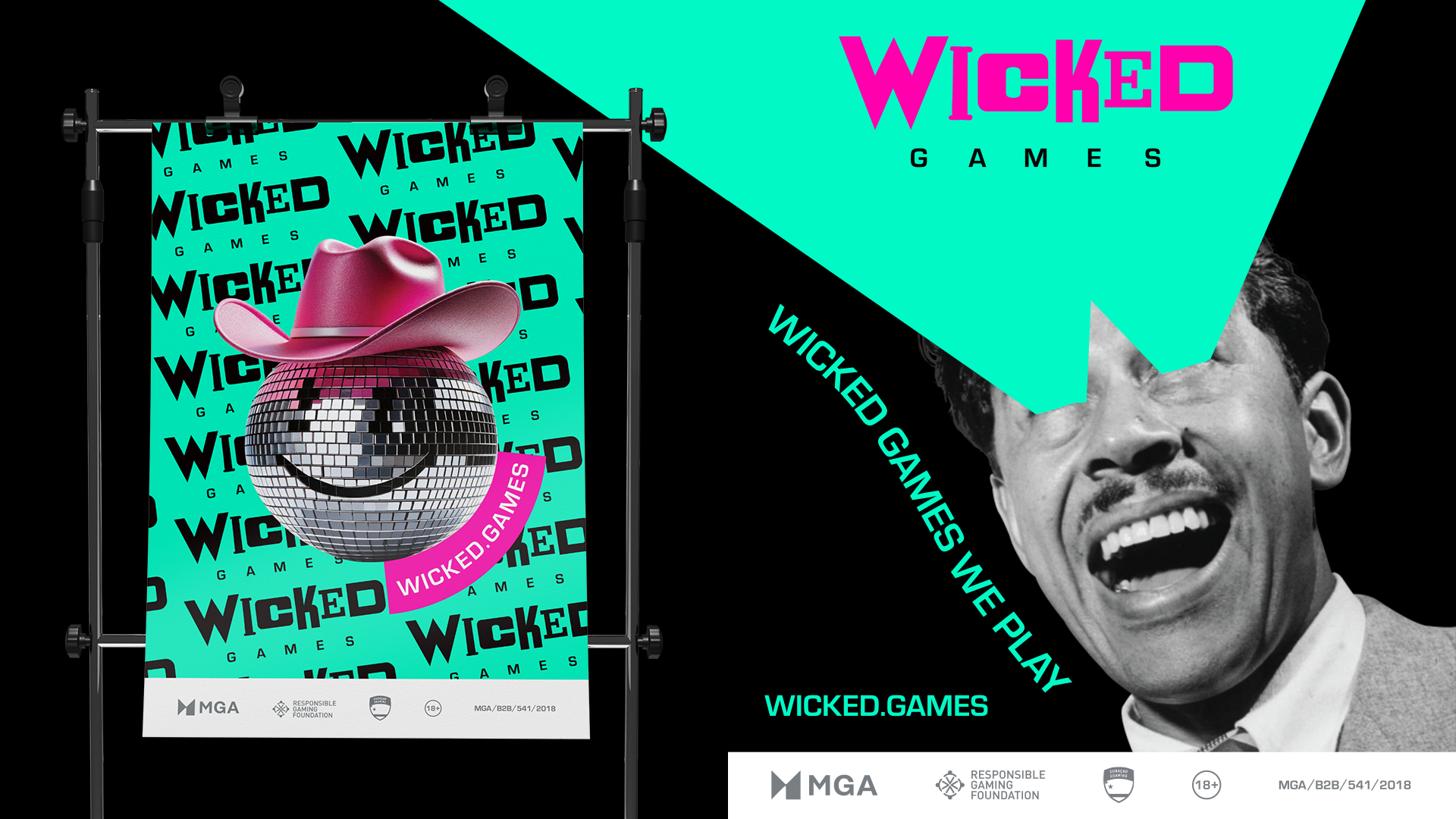
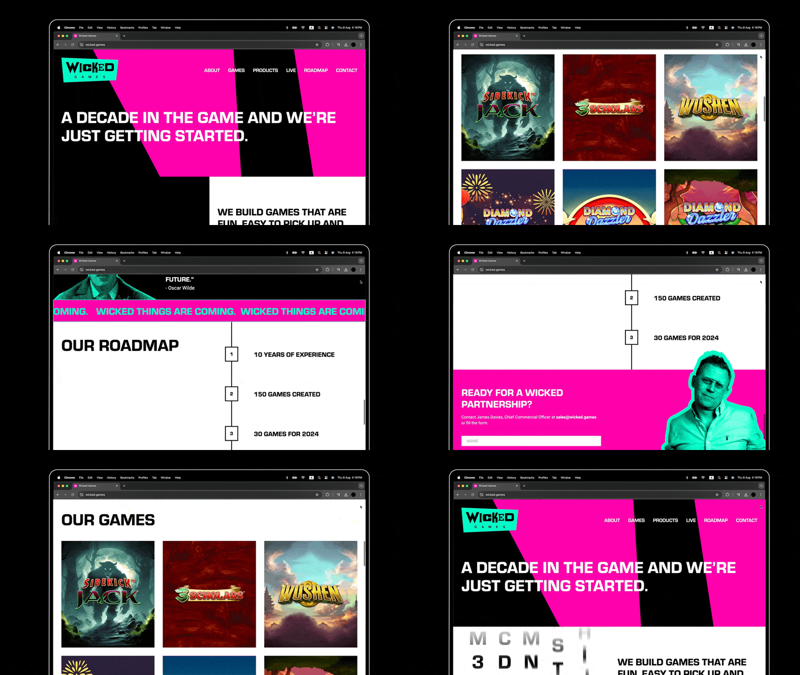
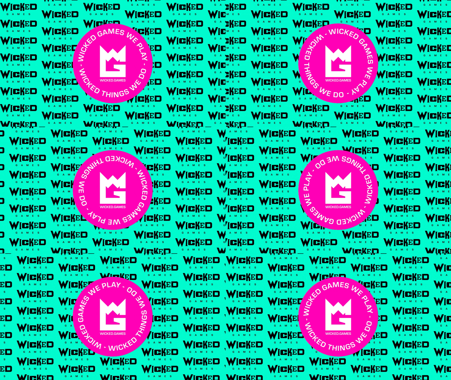
Each project brings its own excitement, but this one allowed us to really step outside the usual boundaries and try something different…or should we say darn right weird.
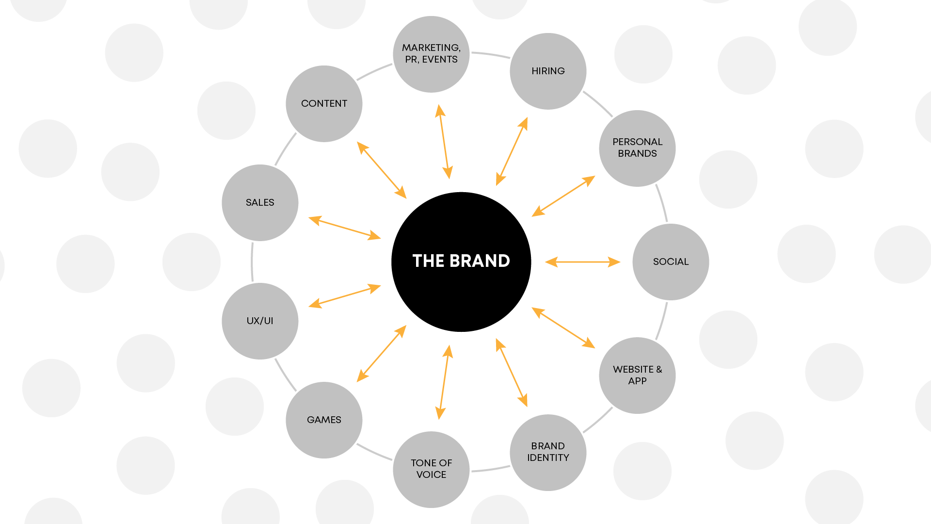
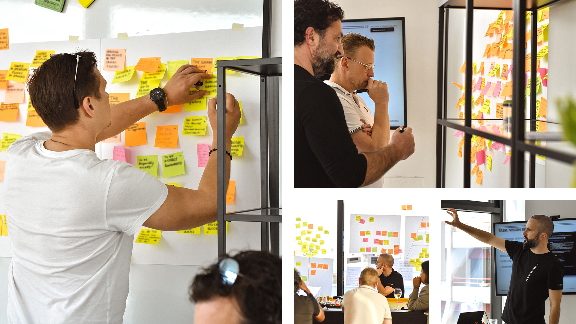
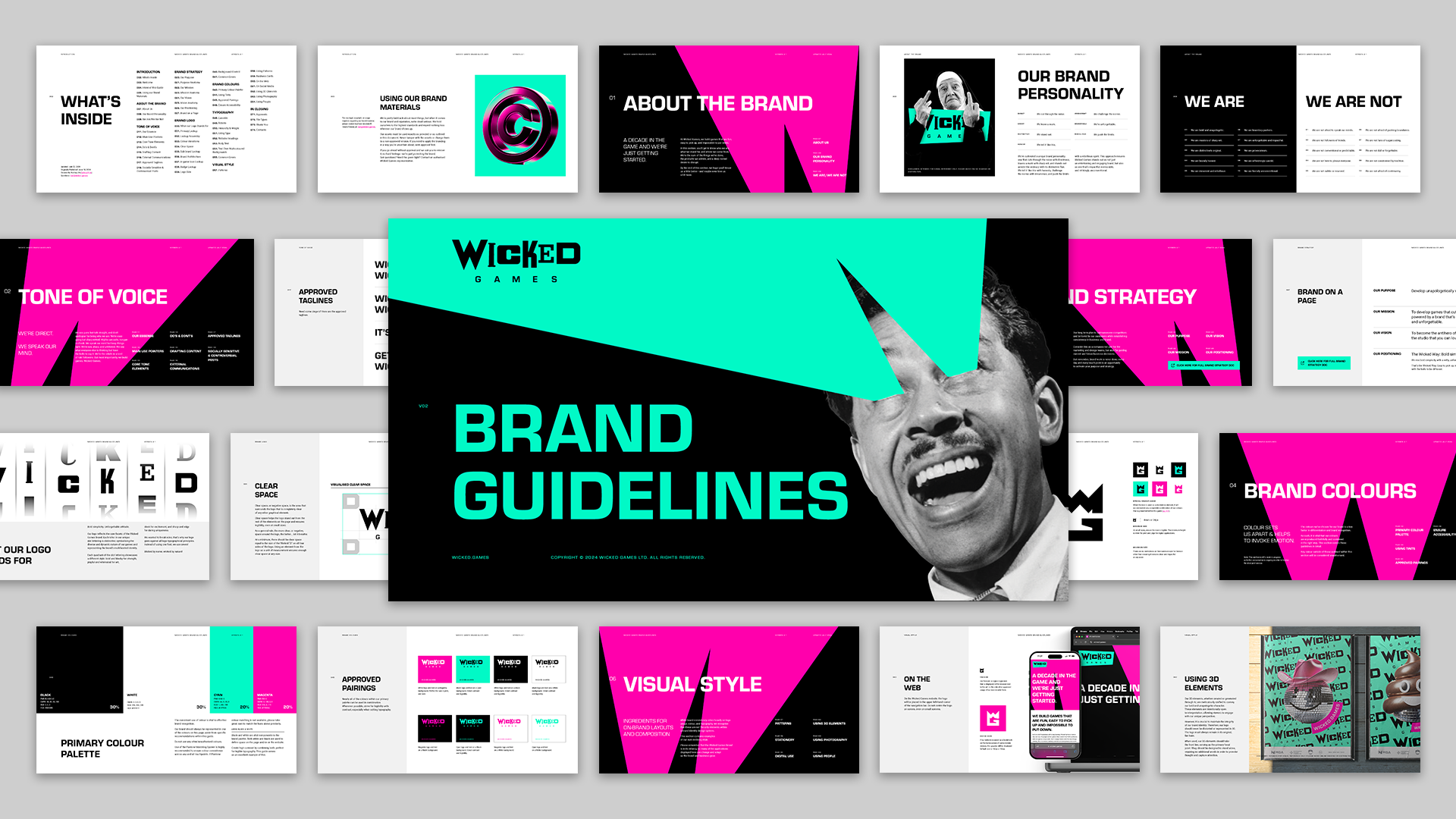
With this project, we had the ideal brand strategy platform to build on, enabling us to create a brand that leaves a lasting impression, turns a few heads, and truly stands out.
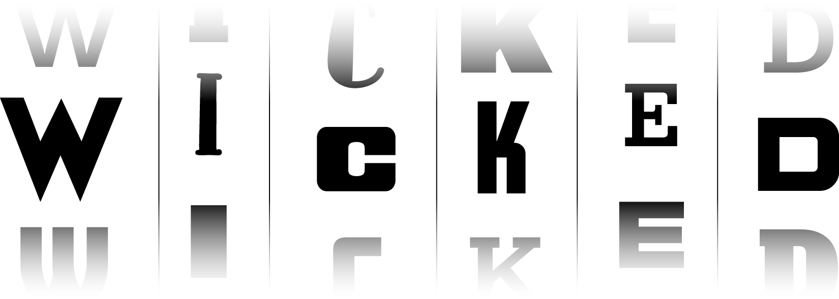
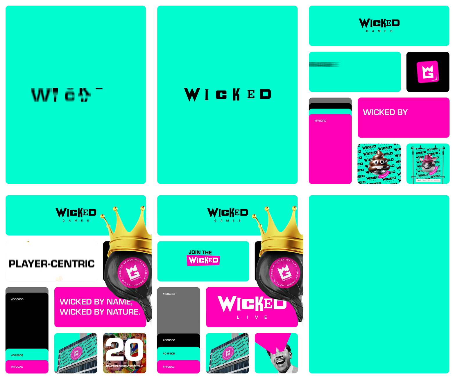
For the logo, we used not one, not two, not three, not four but seven different fonts…something unheard of and a big punch in the face to classic graphic design rules. Why? Because THAT’S WICKED OFC!
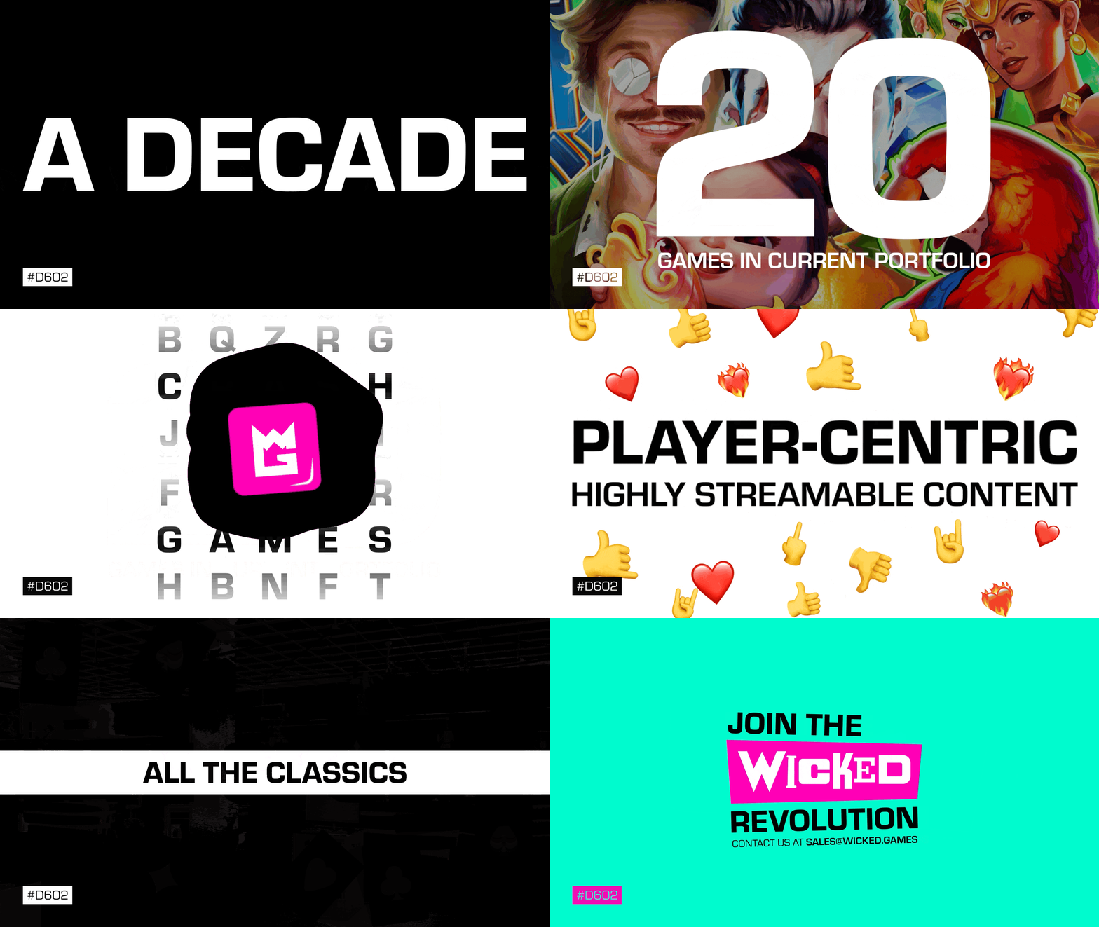
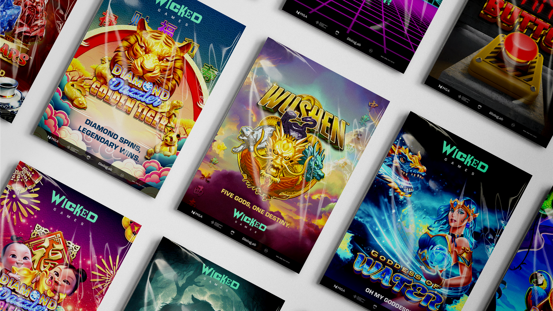
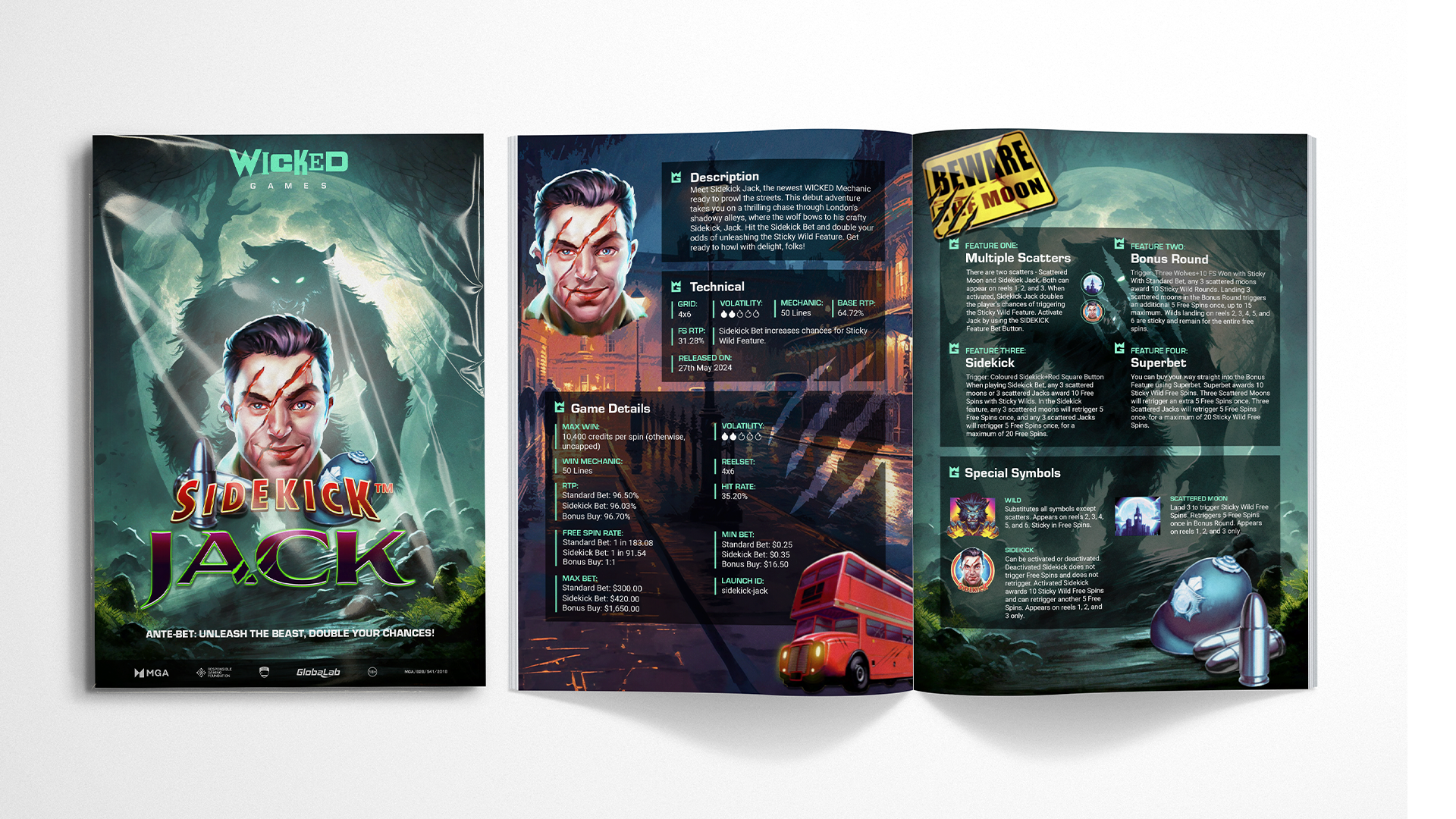
The same rebellious attitude was then applied to the visual, motion and verbal assets.
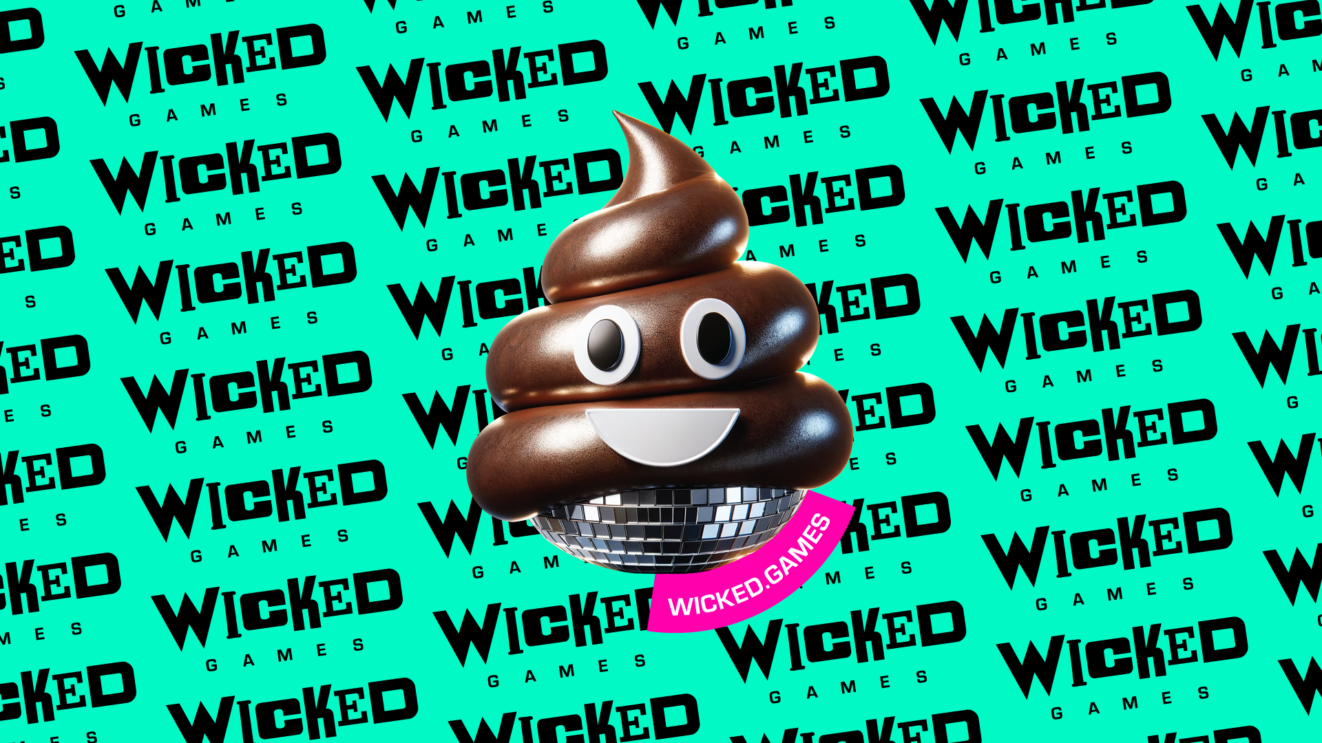
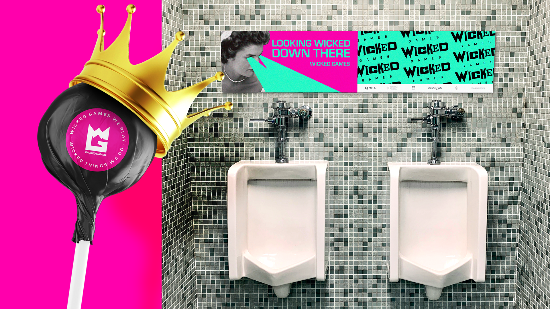
The creative brief was simple: generate as many WTF moments as possible.
Wicked… inside out!

