Crafting a Unique Identity.
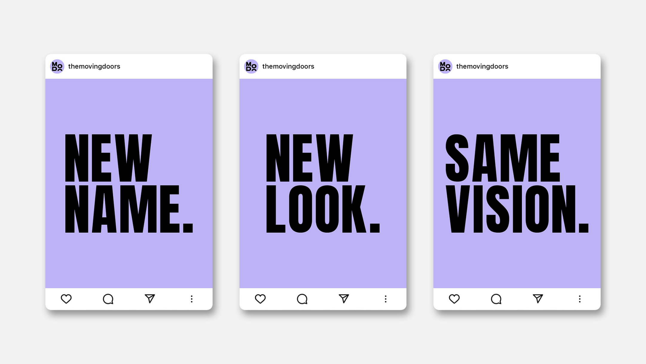
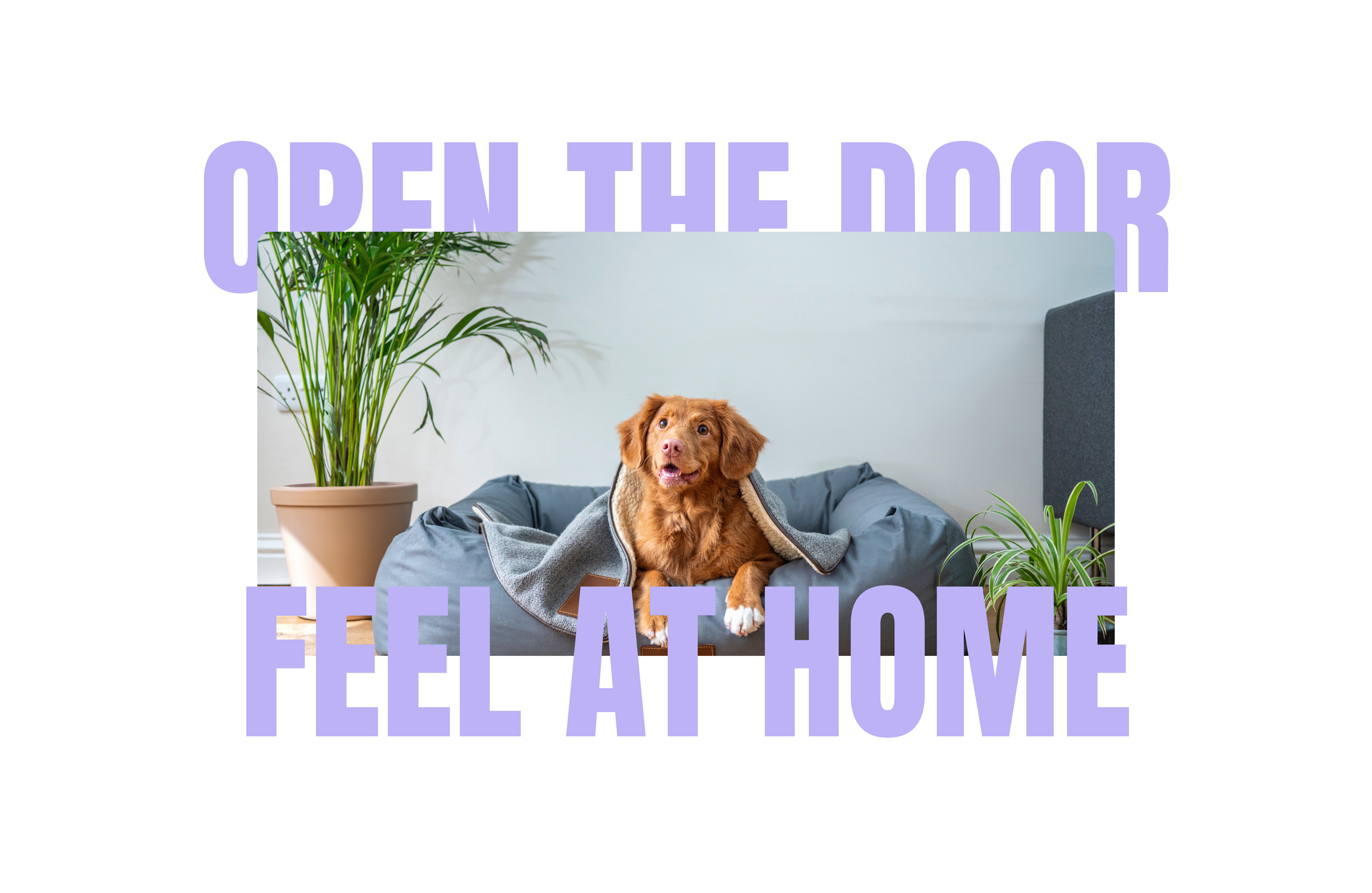
We started with the name itself, a powerful embodiment of flexibility and comfort in ever-changing scenarios: "Feel at home the moment you touch the handle of this door or any door within our diverse portfolio." This name isn't just a label, it's a promise of stability in motion, ensuring a seamless transition from one door to the next, always offering a familiar sense of home, no matter where life leads.
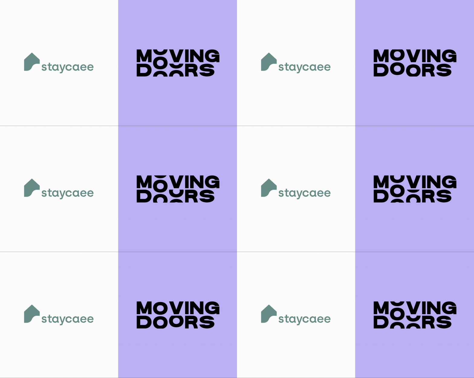
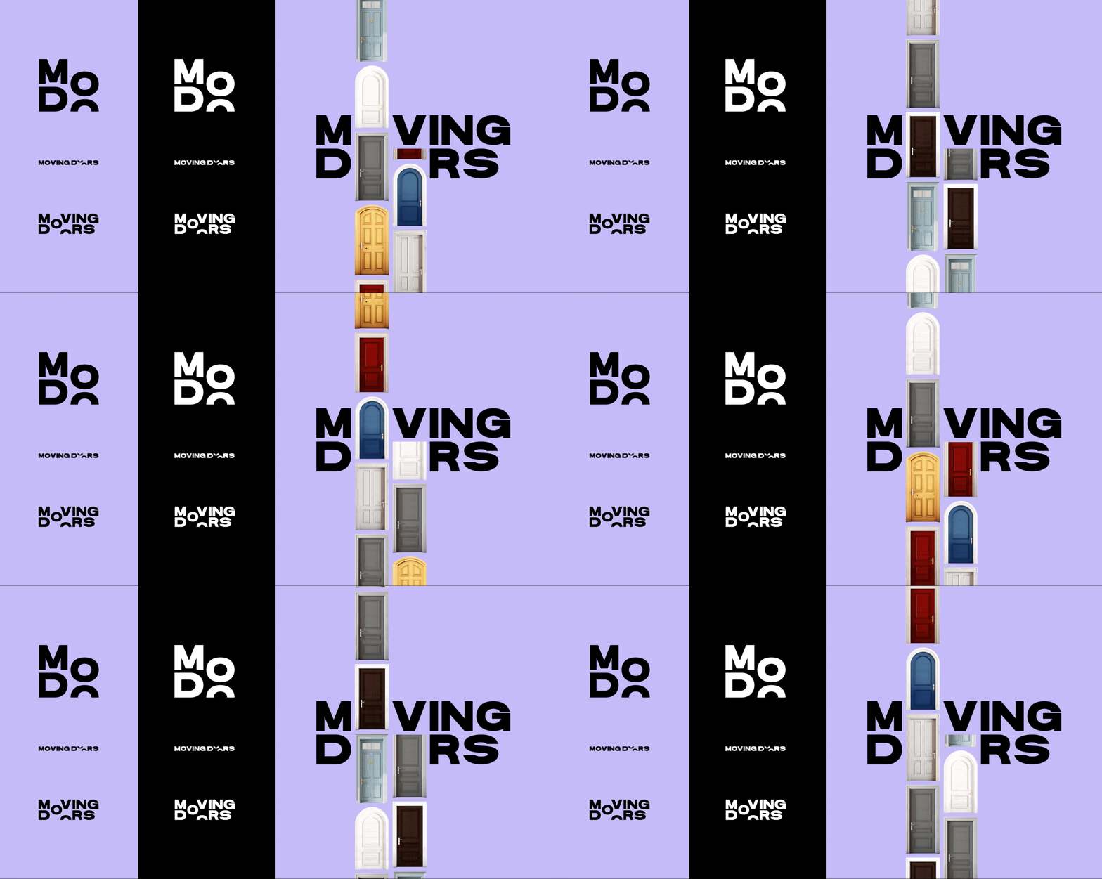
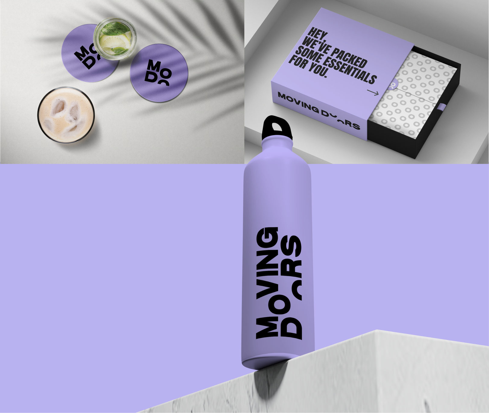
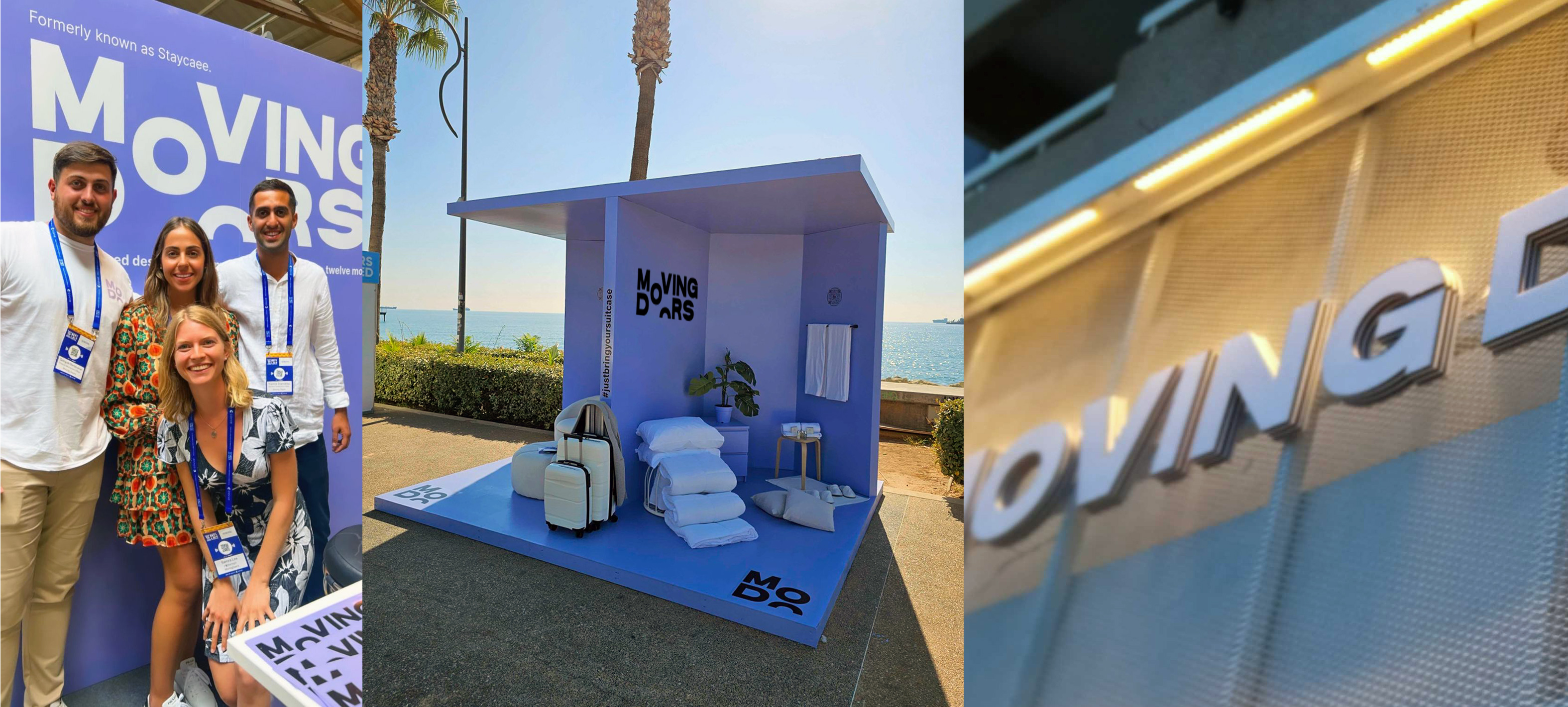
The logo and symbol were designed to stand out in the crowded real estate market. We developed a unique logo that encapsulates the essence of an endless series of doors, symbolising elegance and flexibility. This is not just a logo; it's the gateway to a new way of living, the moving doorway.
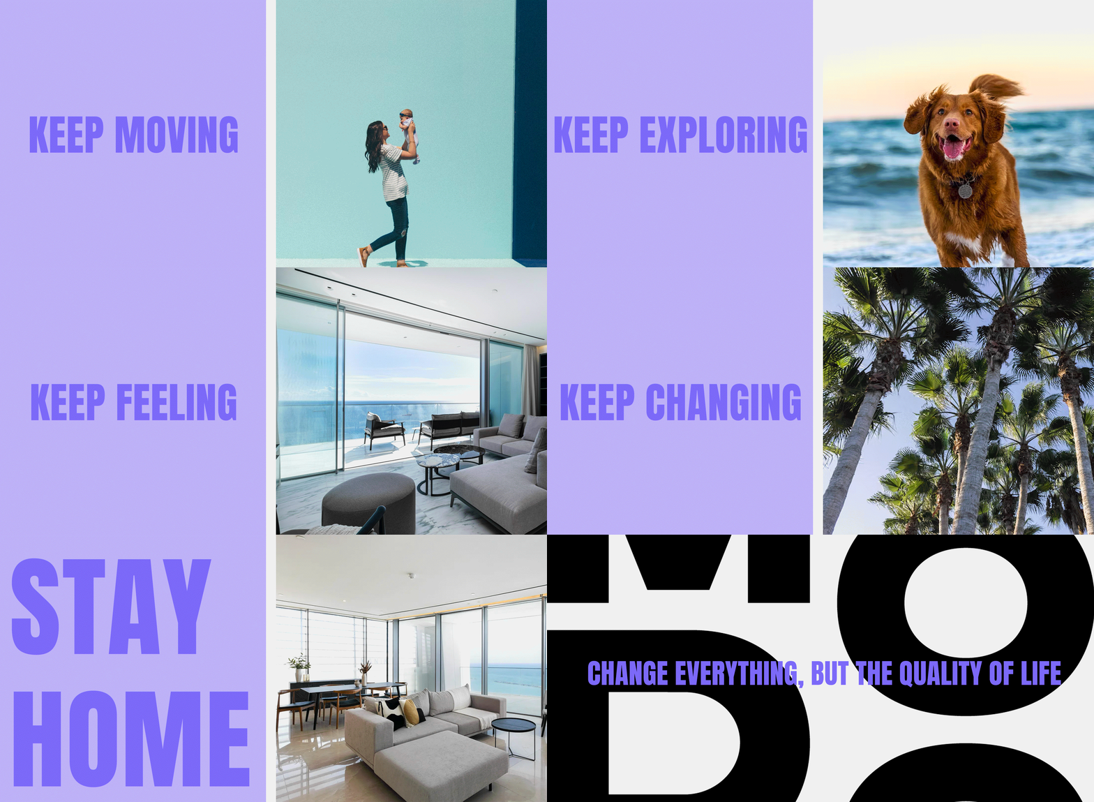
The colour palette breaks away from industry norms, both to grab attention and generate a feeling of sophistication. The design system we've implemented is both revolutionary and evolutionary. It respects the core values of the company while elevating the brand to captivate the right audience, one that values design, comfort, and flexibility in their living spaces.

.png?locale=en)
