🍪Cookies help us deliver our services. By using our services, you agree to our use of cookies. Learn more

Mutable.io

2020

Rebranding the public edge cloud revolution.

Mutable is a top player in the Edge Cloud Computing industry. Their revolutionary technology is moving us closer to a safer, faster, and more reliable internet. Mutable’s creative application of the AirBnB sharing-economy model to servers, enables micro-datacenter owners to generate extra revenue streams while sharing their compute power to the application developers of the 4th Industrial Revolution: bringing you AR/VR, Cloud Gaming, Telemedicine and so much more.

We helped Mutable rebrand and develop a road map which is as dynamic as their team, as scalable as their products and that truly reflects their revolutionary ideas.
  • Brand Strategy
  • Brand Identity
  • Design System
  • Messaging
  • UI & UX
  • Brand Guardianship
Startup Branding and Strategy Mutable

BRAND STRATEGY FOR THE CLOUD

We began by inviting the Mutable team to our offices in Limassol, Cyprus, where we conducted a series of workshops, alternating between branding exercises and brainstorming sessions. The ultimate goal was to develop a clear and effective messaging along with a brand strategy pinpointing Mutable’s market positioning, unique value proposition, and brand story. These sessions aligned Mutable’s core business values of today with who they want to be tomorrow. 

(As an additional bonus, we took our breaks on the beach!)

THE BRAND ROADMAP

In order to carry out the new brand strategy, we developed a road map - planning out a clear path to scaling the brand, which drove both internal and external principles.

Through a series of interactive and iterative processes the roadmap took shape in an extensive 60-page document defining the brand’s:
  • Values
  • Positioning
  • Mission
  • User Personas
  • Clear Messaging
  • Marketing Strategy

THE REBRAND, EVOLUTION VS REVOLUTION

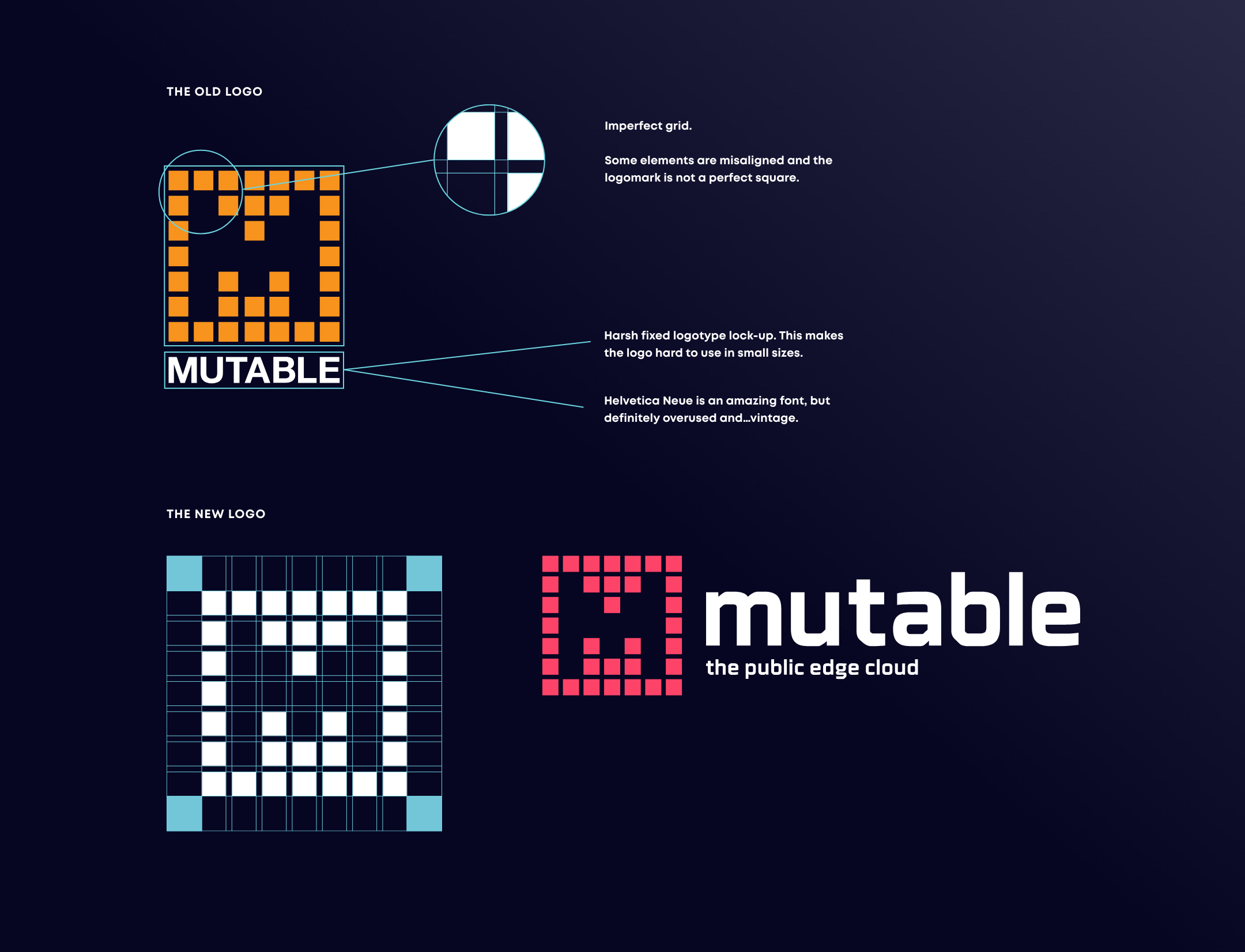
Why fix what isn’t broken?
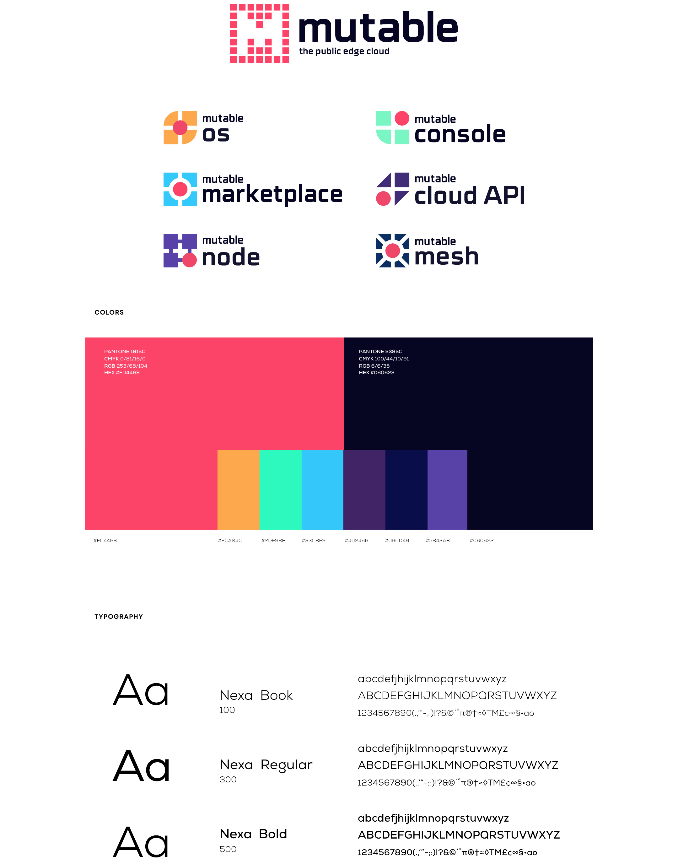
Mutable’s core philosophy was so powerful and still applicable, that the logo only really needed a face-lift. In fact, the logo became the guiding force behind all other UI elements used throughout the new brand. At its core, Mutable’s team of developers, servers, networks, suppliers, and services work collectively as one; this is reflected in the smaller blocks of the logo. The logo is a visual reminder that Mutable is everywhere, because you are everywhere. 

UNIQUELY MUTABLE

The former logo was too tight and rigid, leaving no room for flexibility or scalability. To make matters worse, the use of orange made it virtually indistinguishable from competitors in a crowded market. By updating the colour from orange to ‘Neon Fuchsia’, we added a level of distinctiveness to the brand, while also accentuating the company’s inclusive nature.

DYNAMISM IN MOTION

Mutable’, by definition, expresses “change in form or nature”. Changes have not only occurred in the form of the company’s maturity and accomplishments but also the expansion of its product range. As the company evolves to include sub-brands it’s important to showcase a certain visual continuity linking the logo and the company’s dynamism. Mutable is now ready to make a leap into the future.

A SYSTEM FOR THE FUTURE

The real power of this rebrand comes to life in the design system. A scalable and easy to use visual language. Reusing design components provides flexibility, allowing the Mutable dev team to work seamlessly across the full range of products keeping everything consistent. 

THIS IS JUST THE BEGINNING

Mutable’s journey beyond the 4th Industrial Revolution evokes a continuous iteration for both product and branding. With a design language that can adapt as quickly as the product, the team is now able to focus primarily on product delivery and business development

This is just the beginning of a long journey…If you want to dive deeper into what we’ve done so far check out our blog for more.