Two awards for Hamworthy: the 110-year-old marine brand we rebuilt in eight weeks
Hamworthy spent years inside Wärtsilä. We had eight weeks to bring a 110-year-old name back to market on its own. The result: one bold, independent brand, and two Bronze awards to show for it.
Factory 39
November 6, 2026
5 mins read
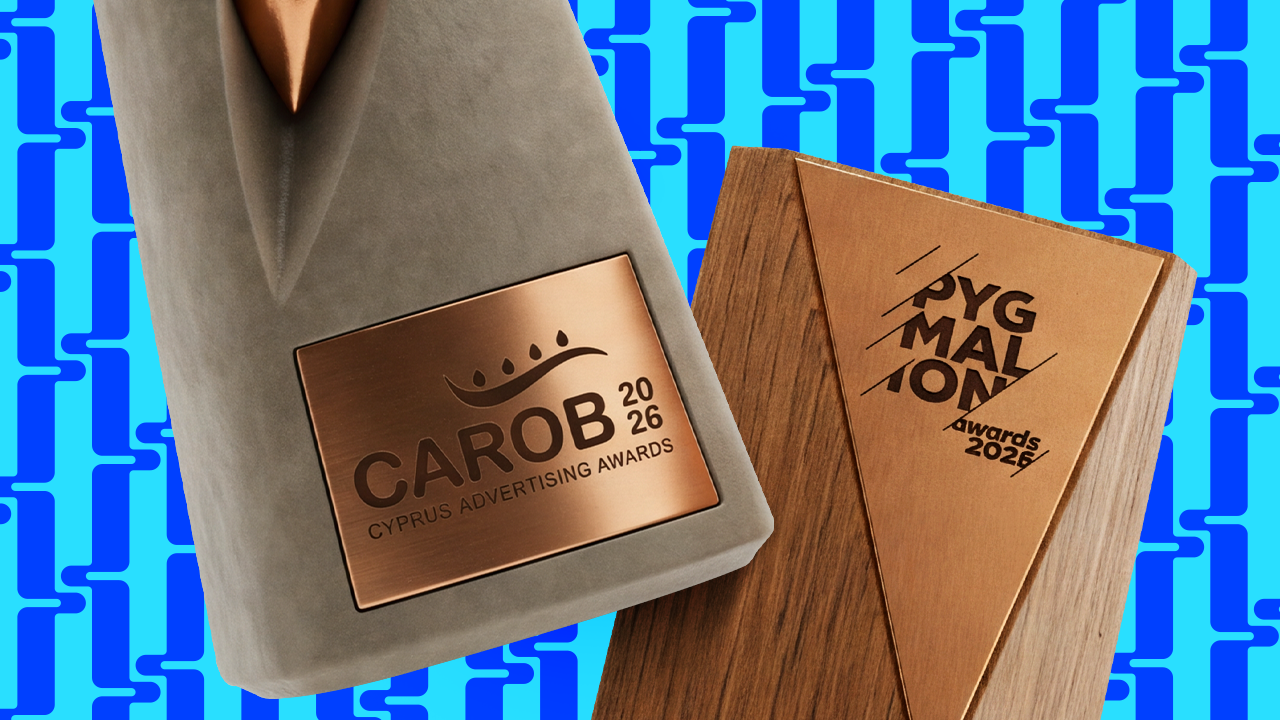
Our rebrand of Hamworthy, the marine water and waste engineering company, has won two Bronze awards: one at the Pygmalion Awards 2026 and a Bronze CAROB Trophy at the CAROB Awards 2026 in Cyprus. We had eight weeks to take a 110-year-old name out of Wärtsilä and back to market as an independent brand, from the first workshop to the stand at SMM Hamburg. Here's how we did it, and what any B2B company going through a divestment, merger or acquisition can take from it.
First, the awards
The Hamworthy identity brought home two Bronze awards:
Bronze at the Pygmalion Awards 2026.
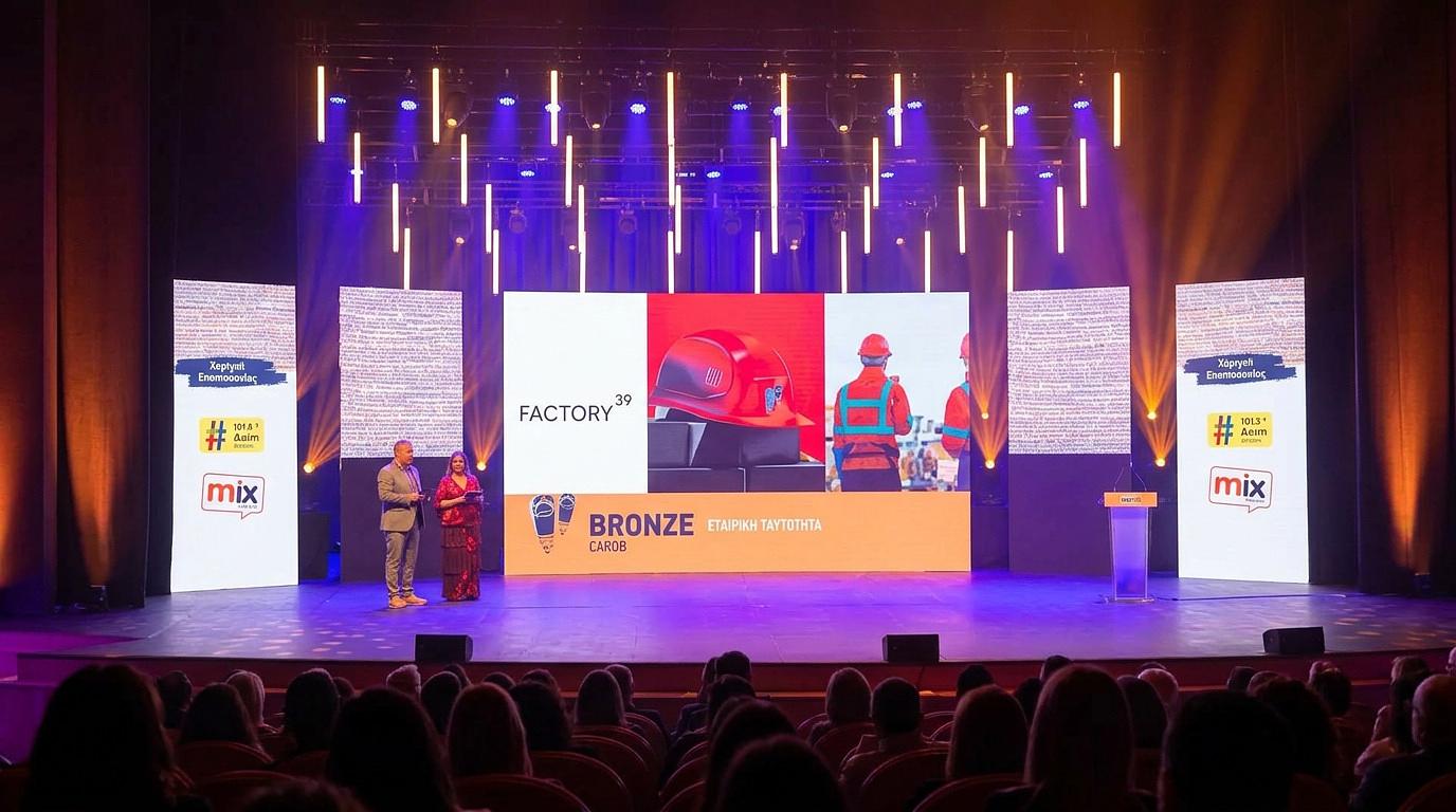
Bronze CAROB Trophy at the CAROB Awards 2026, in Design & Illustration: Corporate Identity. The CAROBs are organised by the Cyprus Advertising & Communication Association and were held at the Nicosia Municipal Theatre.
Awards are nice. Shiny things on a shelf. But what we're proudest of is that a marine engineering brand, in a category where navy blue is practically mandatory, got recognised for being bold, brave and very much strategic. That was the whole point.
The challenge: wake up a name the market had stopped seeing
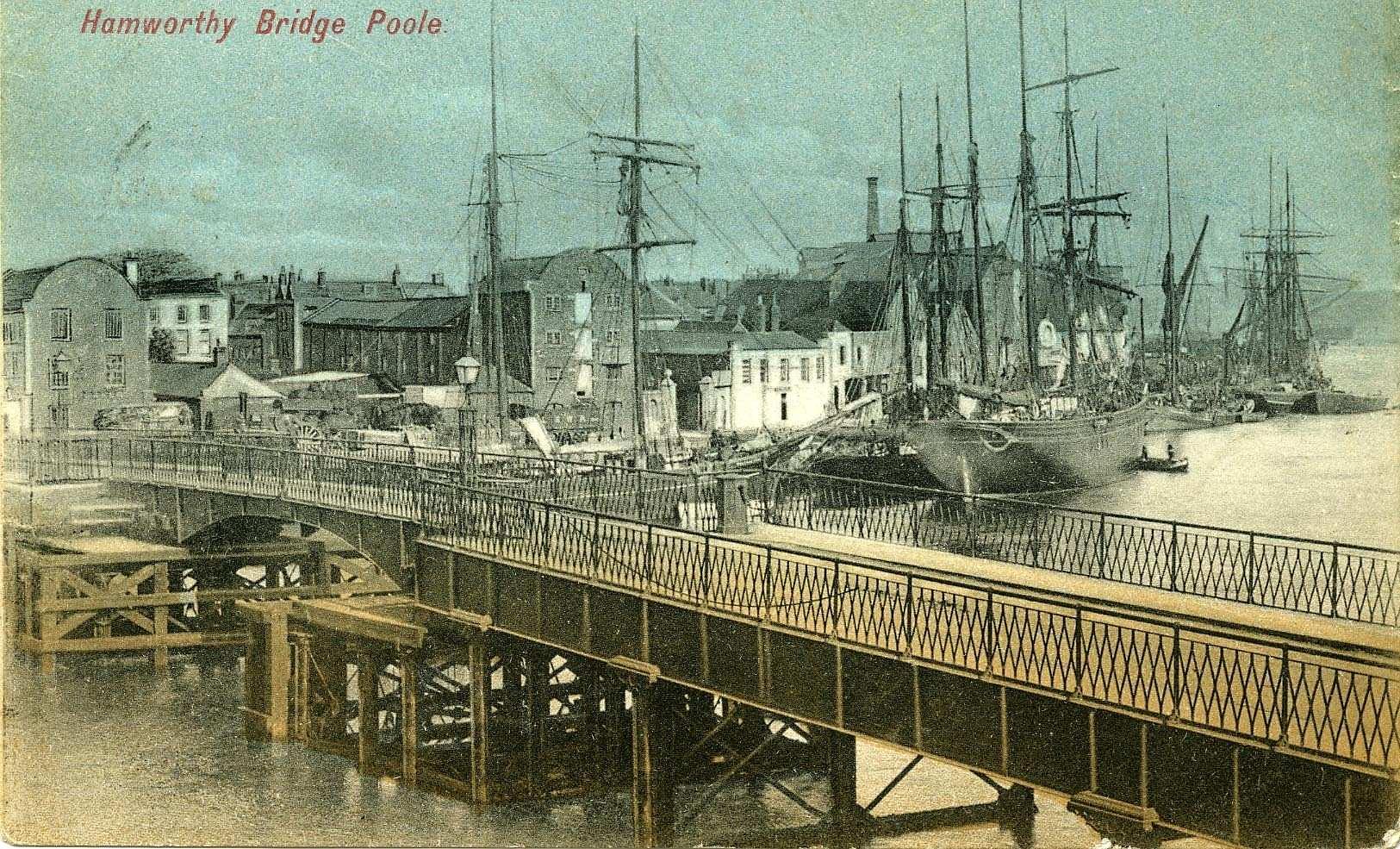
For over a century, Hamworthy has engineered water and waste systems for cruise, commercial and naval fleets worldwide. Then it spent years inside the Wärtsilä masterbrand.
In 2026, after its acquisition by Solix Group, the business was divested from Wärtsilä and returned to market under its own name. That's great news. It also meant walking away from most of the visual recognition it had relied on.
So the brief was a contradiction we liked: continuity and change at the same time. Show the market that the expertise never went anywhere, and give it a reason to look again.
A century of credibility. A name that needed waking up.
The strategy: built with the people who'd have to live it
We didn't write a strategy in a back room and hand it over with a bow. Brand strategy that nobody believes in is just a nice and quiet frankly expensive PDF.
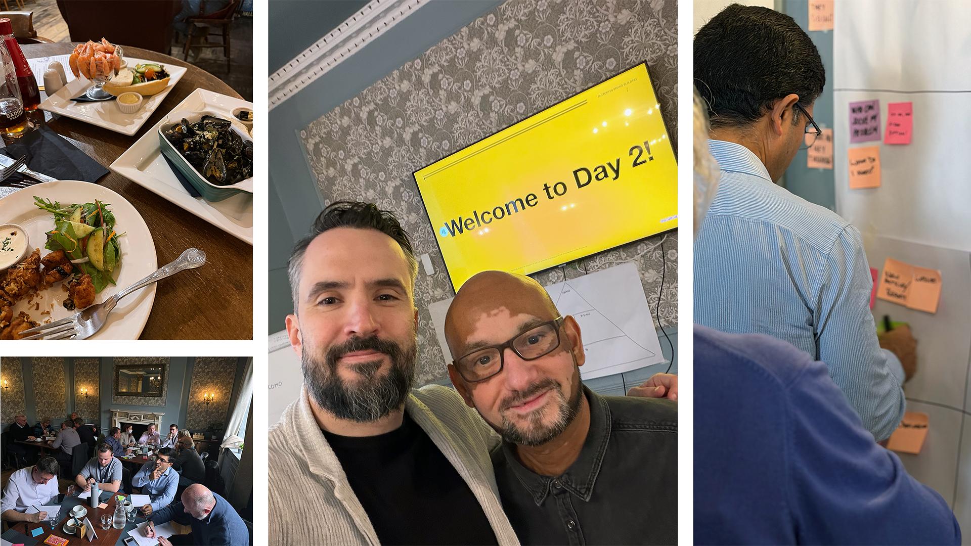
Instead, people from across Hamworthy, from leadership to engineering, service, sales and operations, worked through audiences, values, positioning and voice with us in a hands-on workshop. Because the brand doesn't belong to leadership. It belongs to everyone who represents Hamworthy every day.
And that workshop wasn't off the shelf. Before anyone stepped into the room, we audited the existing brand and researched the competitive landscape: where Hamworthy stood after years inside Wärtsilä, and where its competitors left room to stand out. Every exercise was then built around what we found, so the workshop was made for Hamworthy rather than run from a template.
What came out of it:
Protect tomorrow by treating today.
The logo: two histories, one continuous form
A logo isn't a brand. But it's still the most recognisable asset a brand has, so it had better earn its place.
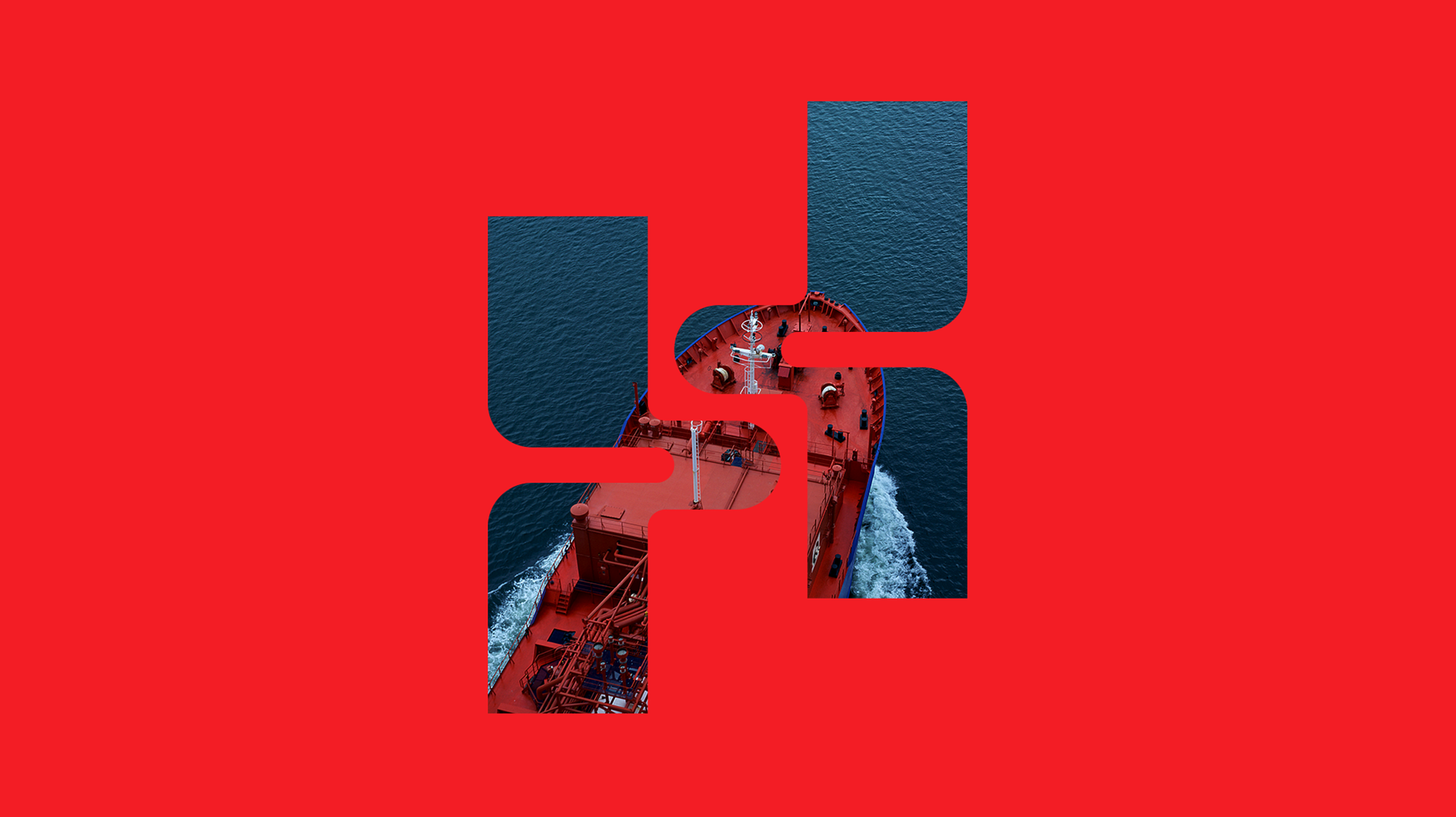
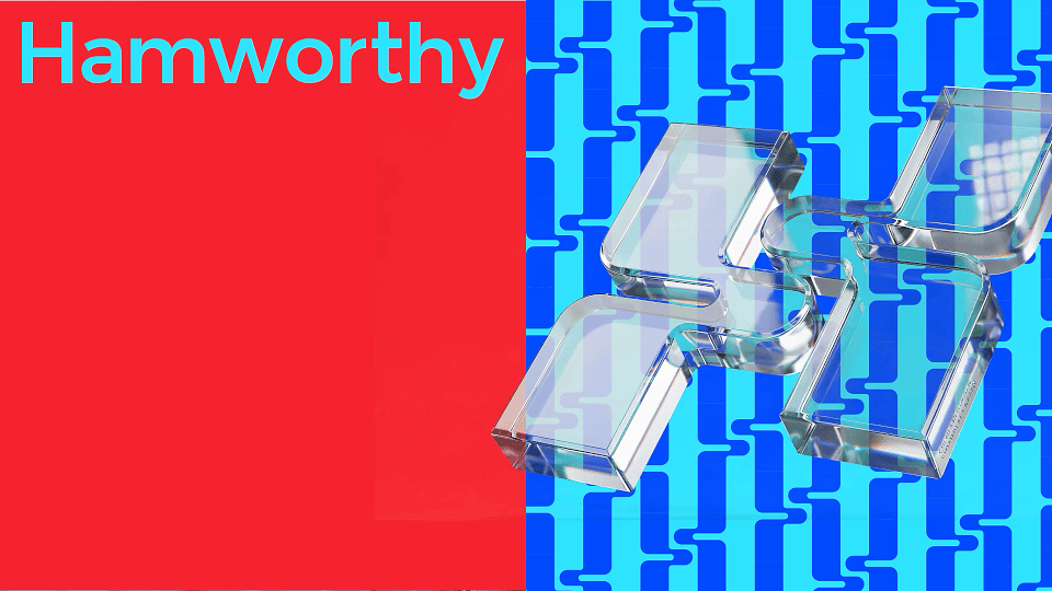
We called the concept Confluence. It's inspired by pipes, flow and water moving from one state to another. The mark brings Hamworthy and Serck Como together in one continuous form that reads as an "H", with a subtle separation between its two sides.
Weighted, purposeful strokes rather than thin, fragile lines. Because this is a brand about channelling serious volumes of water, not drawing pretty waves.
Bold enough to feel industrial. Fluid enough to feel like water and 100% unique to the brand.
The identity: zag where the category zigs
Most marine engineering brands look and sound the same: conservative, technical, interchangeable and… blue. And boring. So we moved Hamworthy as far from that default as we could without losing an ounce of credibility and appropriateness for the industry.
Vivid red and aqua sit alongside black, white, blue and neutral greys. Every colour was tested for contrast and accessibility, with clear rules for when the brand is being functional and when it's allowed to show off.
One system now runs through everything: brochures, presentations, ID badges, signage, workwear, motion and film.
The website: a marine engineering site that doesn't look like one
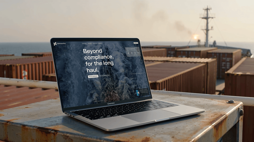
Marine B2B websites tend to be one long hull-at-sunset followed by a wall of PDFs. Hamworthy's had to launch on a date that wouldn't move, and still be more useful than that.
Clear UX routes into the three core solutions (Ballast, Wastewater and Freshwater), direct access to individual products, and service given the same weight as the systems instead of being buried underneath them. Bold type, big imagery and motion up top; structured, specifier-friendly detail underneath.
Less corporate maze. More useful by design.
The launch: inside first, then out
The new brand launched inside Hamworthy before anyone outside saw it: a teaser campaign, the reveal film, an all-hands session and a brand champions programme. Then came the website, customer comms, social, sales material, technical documentation, signage, workwear and exhibition presence.
In September 2026, the new Hamworthy arrived at SMM Hamburg.
"Factory 39 helped us take a complex transition and turn it into a clear, confident brand. They understood the heritage we needed to protect, the independence we needed to signal, and delivered everything at remarkable speed without losing the thinking behind it."
Roberta Dina, Senior Marketing Manager, Hamworthy
What other B2B brands can take from this
Your new brand is judged from day one. A divestment, merger or acquisition is the one moment everyone is paying attention. Use it.
Heritage is an asset, not an anchor. Keep the credibility. Lose the visual habits.
Build strategy with your people, not for them. If they can't say it, it isn't your brand.
Launch inside first. Your team are your first customers.
B2B doesn't have to be boring. Being distinctive is not the same as being unserious.
FAQ
What awards did the Hamworthy rebrand win? Two Bronze awards: Bronze at the Pygmalion Awards 2026, and a Bronze CAROB Trophy at the CAROB Awards 2026 (Design & Illustration: Corporate Identity), organised by the Cyprus Advertising & Communication Association. Both were for work by Factory 39, a brand strategy and design agency based in Limassol, Cyprus.
How long did the Hamworthy rebrand take? The core brand was built against an eight-week timeline, from the first strategy workshop to launch, with rollout continuing through SMM Hamburg in September 2026. See the award-winning work in full: Hamworthy case study
What did Factory 39 deliver for Hamworthy? Brand audit, market research, brand strategy, naming, brand identity, verbal identity, website, brand film, signage and workwear, sales and technical collateral, social and content, and internal activation.
Why did Hamworthy need a new brand? After its acquisition by Solix Group, Hamworthy was divested from Wärtsilä and needed to return to market as an independent brand without losing over a century of engineering credibility.